Steve Koonin in Unsettled notices that presenting the ratio of record daily highs to record lows can be misleading about warming’s effect on extreme heat events. (Chapter 5, “Hyping the Heat”.) That’s true enough, but I find his argument somewhere between nitpicking and weak.
The chapter concerns this plot from this report:
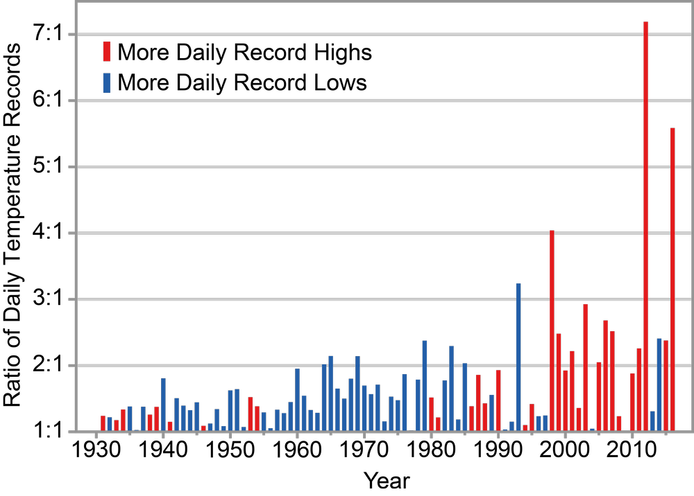
Observed changes in the occurrence of record-setting daily temperatures in the contiguous United States. Red bars indicate a year with more daily record highs than daily record lows, while blue bars indicate a year with more record lows than highs. The height of the bar indicates the ratio of record highs to lows (red) or of record lows to highs (blue). For example, a ratio of 2:1 for a blue bar means that there were twice as many record daily lows as daily record highs that year. Estimates are derived from long-term stations with minimal missing data in the Global Historical Climatology Network–Daily dataset. (Figure source: NOAA/NCEI).
He criticizes this visualization for two choices:
-
The ratio of record highs to record lows is presented rather than the raw numbers of each. This obscures record lows becoming less frequent with no statistically significant change in record highs. If you disaggregate the data regionally, some regions do have significant increases in record-breaking high temperatures. ⏎
-
Record temperatures are counted using the “running” method (the temperature broke that day-of-year’s record when it was measured) rather than the “absolute” method (the temperature is the most extreme over the entire period under consideration). The running method leads to increased variance in the ratio over time even with no warming trend, which in turn makes the ratio plot look misleadingly dramatic.
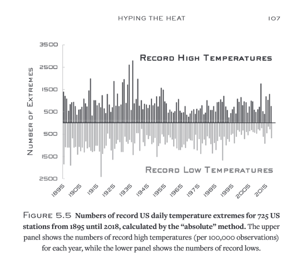
Here’s the same data, presented by Koonin, using absolute counts:
Why use running records?
Given no warming trend, the “running” method produces counts that decrease as the inverse of the number of observations. The closer you are to the beginning of data collection, the easier it is to set a record. The “absolute” method yields counts uniformly distributed in time in the same scenario.
Koonin calls this a “big problem”a a p. 104 ⏎ with running records, but it seems mild enough to me—statistical methods used to infer trends account for their less intuitive properties, and even by eye you can read off deviations from the theoretical no-trend curve.
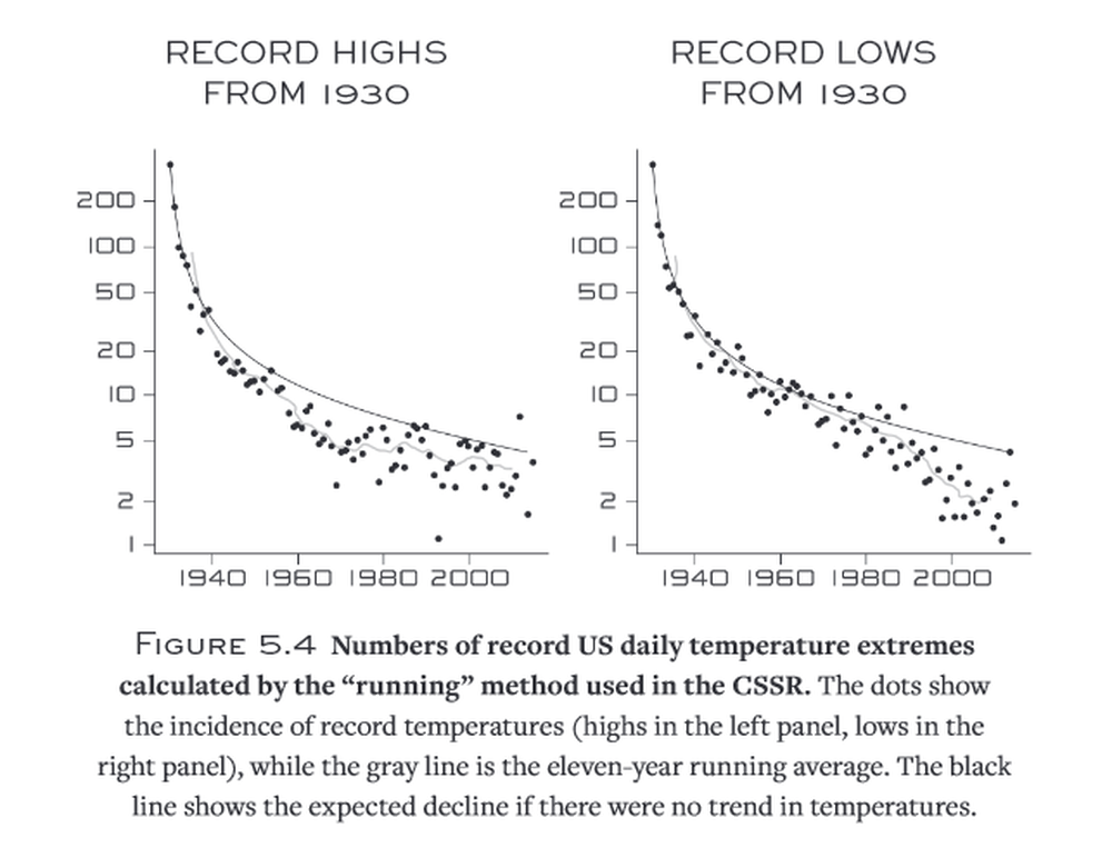
Historical running records are nice because they don’t change as new data is taken. Analyses using the running method remain compatible as time goes on and data accumulate, both for historical observations and for projections.b b If a temperature was the highest ever when it was measured, it will always have broken the record at that time. If I measure a higher temperature this year, I have to go back and revise the history of absolute records but only add a new data point to history of running records. ⏎ I think that’s the main reason to use it, and that it’s incorrect to call absolute records “proper” or “standard” in comparison.c c p. 106 ⏎
Koonin’s deeper objection is that, combined with taking the ratio of record highs to record lows, the denominator of the ratio will decrease over time in the absence of warming, increasing variance. In contrast, the absolute method would have the same (low) denominator over time and constant high variance. This means the running-record ratio gives the impression of recent and unprecedented huge spikes in the number of record temperatures regardless of trend. Koonin concludes:d d pp. 105–106 ⏎
While it produces a scary visual, this ratio has almost nothing to do with how temperatures are actually changing.
I agree that the visual is easily misinterpreted, but it’s not the case that the ratio has almost nothing to do with how temperatures are actually changing. It seems by eye that the ratios increasingly favor warming in recent years, and this is in fact statistically significant.1
Moreover, the ratio is informative in ways that raw counts aren’t. This why I call the chapter a nitpick at worst—the ratio is specifically informative. ⏎
Why use the ratio?
It would have been more natural for the report to have presented separately the numbers of record highs and record lows, instead of their ratio, which, as we’ve seen, is rather contrived. But that would have looked something like the declining curves in Figure 5.4, making it difficult to offer increasing temperature extremes as evidence of a broken climate. I would be delighted if someone could explain how this misleading analysis was in the service of informing rather than persuading.e e p. 109 ⏎
Sure. Trends in record counts can come from trends in average temperature or from trends in temperature variance. Warming trends can be masked by historically extreme periods, like the warm and high-variance 1930s, or analogously by the trajectory taken by a particular projection.
The current level of warming, not temperature variance, shows up in the ratio of record highs to record lows. In a stationary climate, the ratio is 1. As long as the climate is warming, it’s greater than 1. The purpose of the work you cite studying the ratio is to establish a relationship between the change in average temperature and this ratio—one that’s independent of projected warming scenario and straightforwardly allows correction for model bias.
I agree that the CSSR is wrong to write that “the number of record lows has been declining since the late-1970s while the number of record highs has been rising” with reference to that work, which does not support the latter claim. Your complaint that “the Executive Summary of the CSSR prominently features the faulty ratio graph (our Figure 5.1) with the legend ‘Record warm daily temperatures are occurring more often’” appears to have been addressed in the version currently online. I have no objection to their use of “increasing temperature extremes” to include heat waves.
Cool nights warm faster than hot days
The ratio still obscures that most of the change has been driven by less frequent record lows. Here I should point out that climate models, including those used in this report, do predict minimum temperatures go up faster than maximum temperatures. Koonin doesn’t contradict this, but he also doesn’t go out of his way to mention it.
This isn’t a consequence of models being tweaked to match observations, but rather a very natural physical result. If we simplify as much as possible, power radiated by a black body scales with temperature to the 4th power. So increasing an equilibrium temperature from 50 °C to 51 °C takes over twice the power of an increase from 0 °C to 1 °C, all else equal.
Physical models still have some bias favoring record highs compared with observation, even accounting for the warm 1930s. Increased maximum temperature also comes with increased cooling from evapotranspiration, depending on precipitation; these models have less precipitation than observed, enough so to account for the remaining bias.2
Unfortunately, this doesn’t mean that global warming just means milder winter nights. Even if hot days warm less than cold nights, the difference is most pronounced for these record-breaking single-day extremes. There’s plenty of room for heat waves beyond what life in a region has adapted to.
Extreme heat is still getting worse
Koonin ends the chapter:f f p. 110 ⏎
In short, I would summarize the data on extreme temperatures with the following statement. It has far less headline potential than that from the CSSR quoted at the beginning of this chapter, but has the advantage of being correct:
There have been some changes in temperature extremes across the contiguous United States. The annual number of high temperature records set shows no significant trend over the past century nor over the past forty years, but the annual number of record cold nights has declined since 1895, somewhat more rapidly in the past thirty years.
Of course, temperatures getting milder in this way (fewer harsh winters and cold evenings) makes for a very different (and less alarming) story than torrid summers and blazing afternoons becoming more common. As it happens, the evidence of a rise in the coldest temperatures is perfectly consistent with a warming globe—just not a “roasting” one that lends itself to graphics of bursting thermometers.
While his restatement is, as far as I can see, more strictly correct than many headlines, his intimation that temperature trends are due to milder winter nights is itself misleading. The report he’s criticizing discusses several lines of evidence, and it’s hard not to conclude that we should expect (and are already experiencing) more extreme heat.
Maybe the most obvious next line is looking at heat waves rather than record highs. While there are still threshold effects complicating the expected response of heat waves to warming, they’re found to be increasing in length, intensity, and frequency in most regions.
Now tell us how you really feel
Sorry, I’ve only skimmed the rest of Unsettled. Overall, I’m not impressed, but it’s closer to the scientific consensus than many (most?) people get. If someone’s excessively skeptical or despairing, it may be better than nothing. Popular communication around climate is in a disappointing state. Koonin’s not wrong that accurately relaying the IPCC reports can make you sound like a climate skeptic.
I don’t want to speculate about how the book’s contrarian gloss affects reach and persuasion. I find it distasteful and superfluous. Even if it does make certain people more receptive, I don’t believe scientific communication should or can be calibrated to some target imagined response.
My best recommendation is still to read the summaries from the IPCC working groups on the physical science basis and impacts of climate change. The summaries won’t take long, and that’s enough to start noticing when you’re being lied to.